The graph below shows the results of SSC exam of ABC Secondary School from 2008 to 2012
The graph below shows the results of SSC exam of ABC Secondary School from 2008 to 2012. Describe the chart in 150 words. You should highlight and summaries the information given in the chart.
 |
Answer:
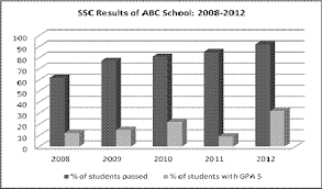
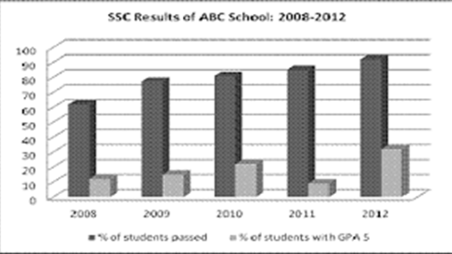
This is a bar type graph. The X axis shows the years sequentially and Y axis shows the unit. Every datum of the graph shows the ups and downs of the unit.
The graph shows the results of SSC examinations of ABC Secondary School from 2008 to 2012. In general, the graph shows a gradual improvement of the SSC candidate’s performance within this time. It is seen from the graph that the pass rate increased from 60% in 2008 to 92 % in 2012.
The graph also shows an increase of candidates who passed with a GPA 5 except in 2011. In fact, the school had the lowest rate of GPA 5 holders in 2011, which was only 9%. The performances of the SSC candidates were almost similar in 2009 and 2010, with slightly better results in 2010. The school recorded the best results in 2012 when the pass rate went beyond the 90% mark. Moreover, a record of 32% of candidates passed with a GPA 5 this year.
Overall, the graph illustrates that the SSC results of ABC Secondary School are improving steadily.

